Scope and goals
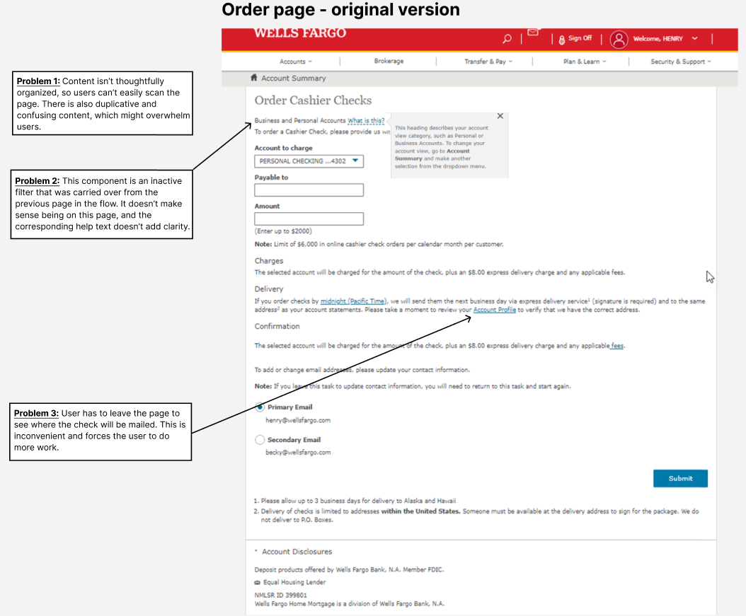
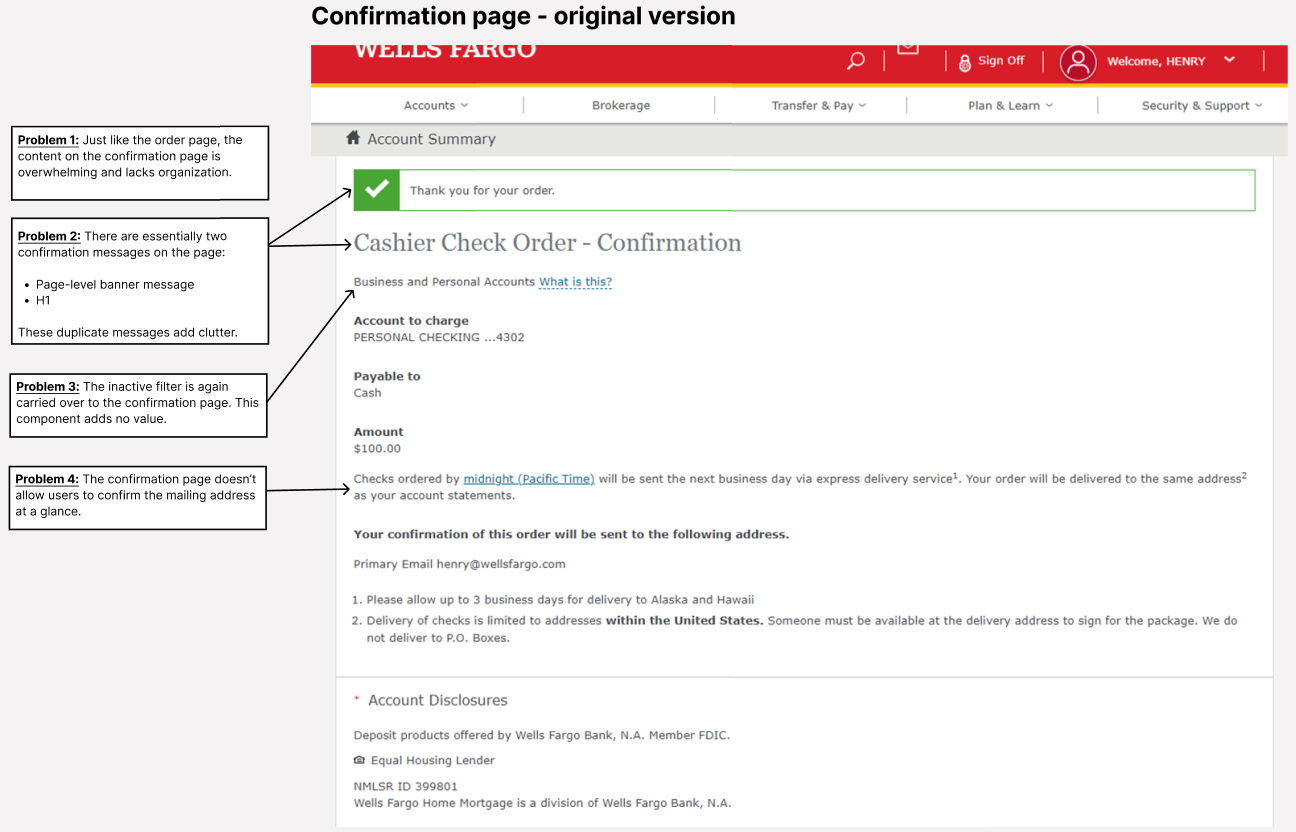
Scenario: Previously, the Cashier’s Check page had an outdated design with old legacy content, and it was only available on desktop.
Goal: Our goal was to give the experience a total makeover by:
- Adding an entry point from the native app
- Upgrading the page with a mobile friendly design
- Making the experience feel more user centered
Project team and roles
- Me (content designer and project lead)
- UX designer
- Project manager
- Legal/compliance team
- Development team
My approach
1. Simplify and restructure
When looking at the original version, I could quickly see that the information architecture needed to be adjusted. The page wasn’t very scannable, because there was too much content and it wasn’t grouped in an ideal way.
There was also duplicate content, confusing components on the page, and some of the help text wasn’t contextually located, leading to an overall poor experience.


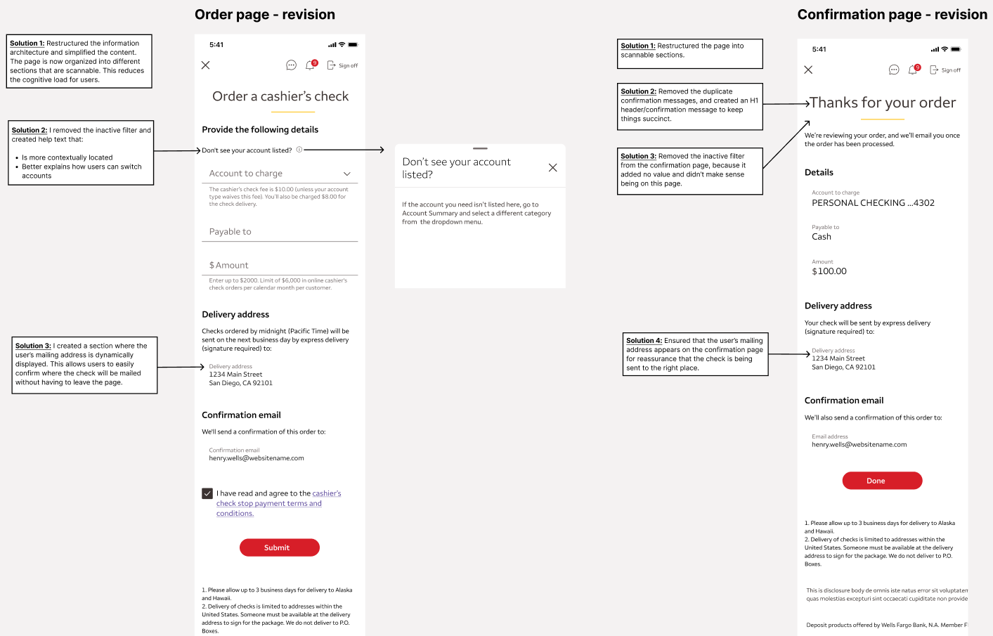
My first step was to clean up the content and start organizing. To do this, I thought about the experience from a user’s point of view. For example, if a customer was ordering a cashier’s check in person, what would that interaction look like?
I wanted the actual structure of the content on the page to feel conversational—not just the copy itself—so that the flow would be more intuitive. With that in mind, I organized the content into different sections that guide the user forward.
Next, I cleaned up the duplicate content, ensured that any help text was contextually located, streamlined the flow, and provided a way to include the Terms and Conditions from our legal team.
2. Refine and iterate

After this first revision, our team felt much better about the overall flow and scannability.
But I still wasn’t thrilled with the content. While I managed to streamline the content, the experience felt too transactional. I really wanted to push the boundaries of Wells Fargo’s voice, which at the time was lagging behind competitors and didn’t sound human enough.
3. Revise for voice and tone
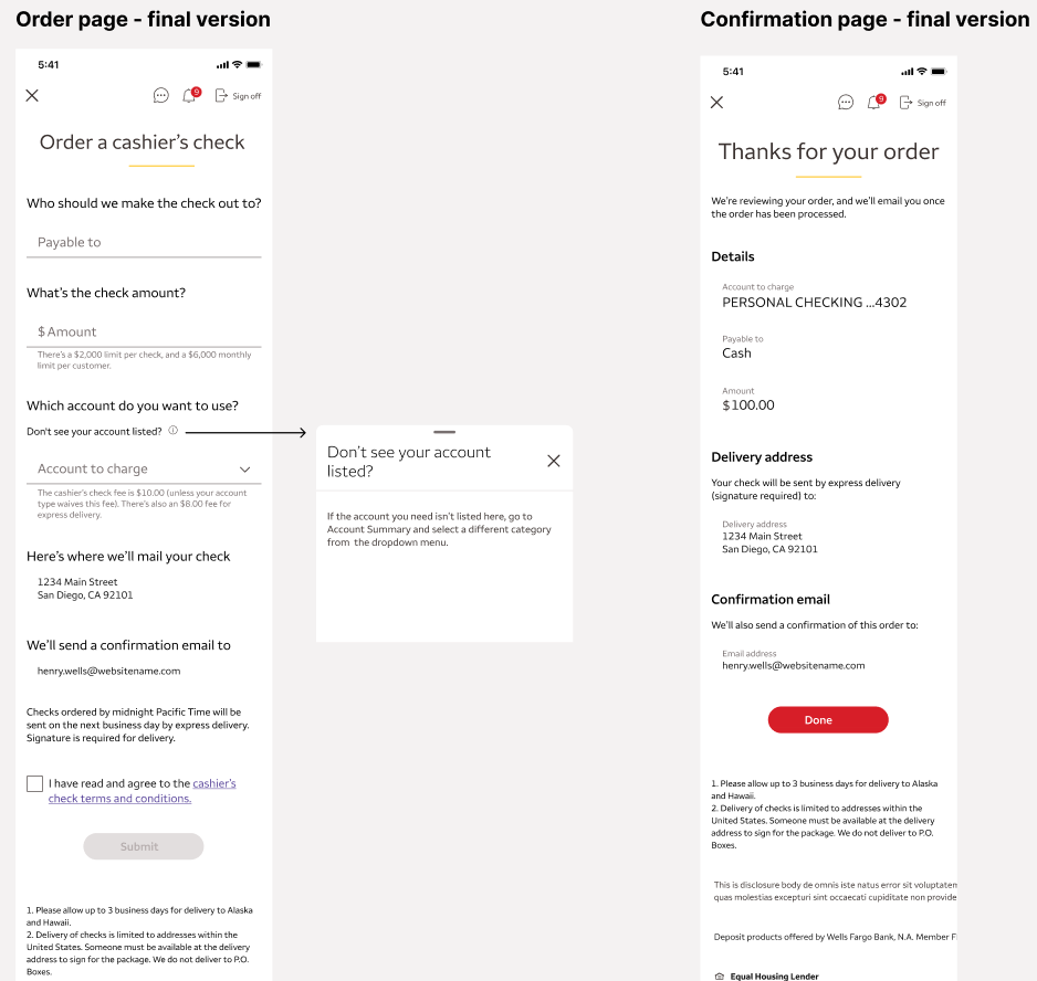
With this in mind, I re-wrote the content using a more conversational voice and plain human language. This minor tweak totally changed the feel of this experience; it feels more like a personal interaction between a customer and their banker.

When I presented this to our senior leadership, I placed the two versions side-by-side (transactional vs. conversational). They could easily see how the conversational version made the experience feel more intuitive and modern, and that’s the version that was ultimately chosen and implemented. This was a major success for content, because most projects until this point were still using the old legacy voice.
Learnings and takeaways
This project showed me how essential information architecture is, and it illustrates why a content-first approach is best. The content is basically the skeleton or foundation of a design, and the structure of the content itself needs to be conversational.
When the information architecture feels like a conversation between the screen and the user, it helps keep up momentum. Without this, the user might be overwhelmed, especially when faced with a wall of text.
Another success of this project was my ability to get buy-in from our leadership to use a more conversational, human voice. After this design was approved, the content team used it as an example for adopting a more modern voice.
